What Brakes wanted
Brakes saw an opportunity to accelerate growth by moving from a brand-centric to a customer-centric digital ordering experience and chose Biglight to help them.
This would mean replacing a previously disjointed digital customer experience – which spanned an order taking website for customers only, a limited marketing site for non-customers, and standalone sites for its Woodwards and Country Choice brands – with a new cohesive set of digital experiences driven by customer needs.
These new digital experiences would make it easier for customers and prospects to discover what Brakes has to offer, make it easier to engage and transact with the business and offer unparalleled levels of value, service and support, whilst reducing business costs.
It would also be accessible and inclusive, so that customers of all abilities and backgrounds could benefit from the services the business offers. Providing a solid foundation for growth.
What we did
To be truly customer-centric, a business needs to know more than who its customers are – it needs to understand their needs and motivations across multiple roles – at a practical and emotional level – and how they translate into customer journeys and buying behaviours.
This was the crucial starting point in our work with Brakes – gathering detailed insight to inform every aspect of growth-orientated, customer-centric experience design.
We used insight from the Brakes team and existing customer research, supplemented by our own research and analysis of Brakes’ existing data, to form a deep understanding of customer needs and the way these were currently being met.
This research revealed a series of opportunities to improve the customer experience across the core journeys and validated the priorities the business had set out for the project. It also allowed us to define four measurable business objectives that would guide prioritisation during the design process.
We designed a new, fresh and clean creative direction for the website, based on the existing brand guidelines, but adapted for digital use that took into account the advanced accessibility requirements of this project. These creative guidelines then provided the foundations for a new UI design system.
We created an extensive visual library using iconography to support non-verbal communication – using icons and pictograms to represent allergens, food choices, vegan, vegetarian and gluten-free options to improve accessibility and inclusiveness.
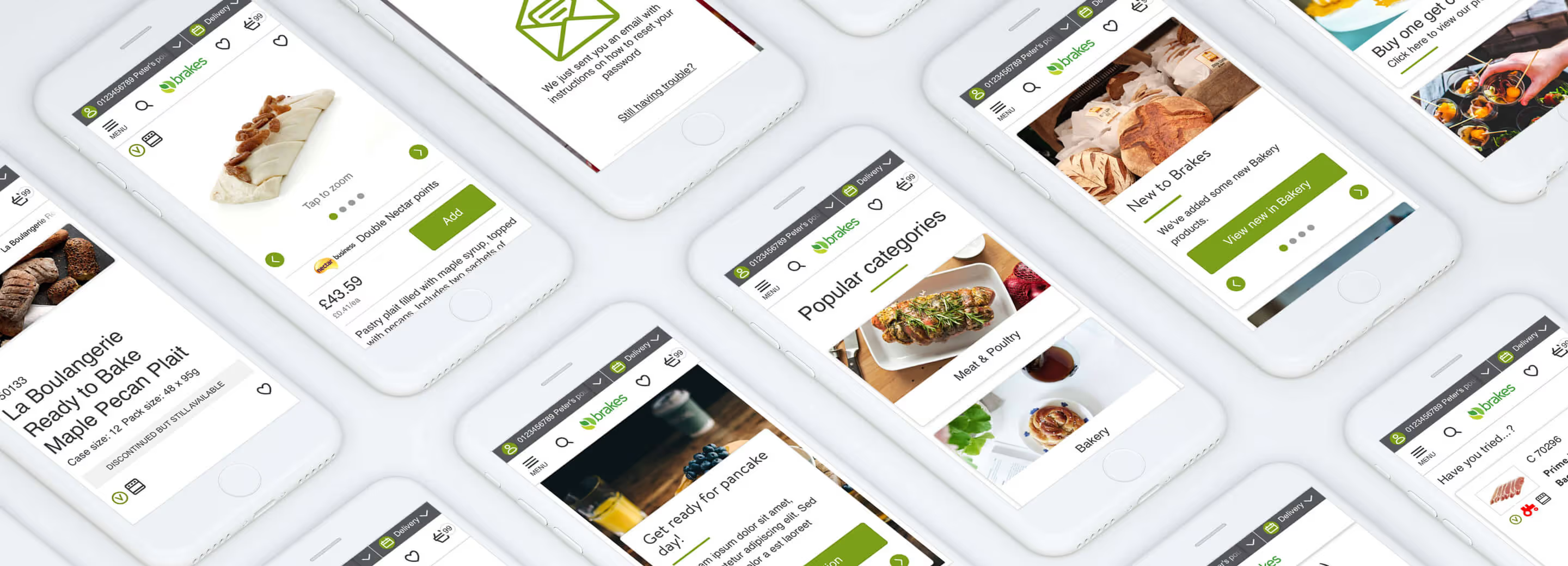
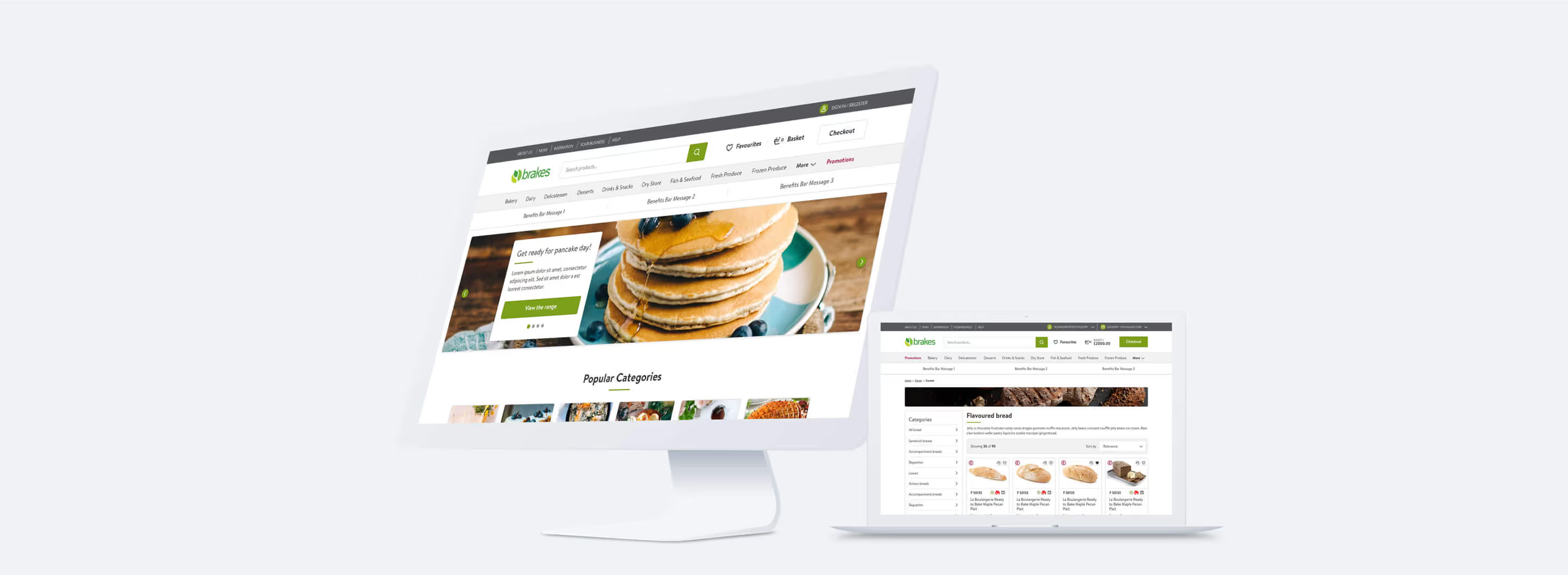
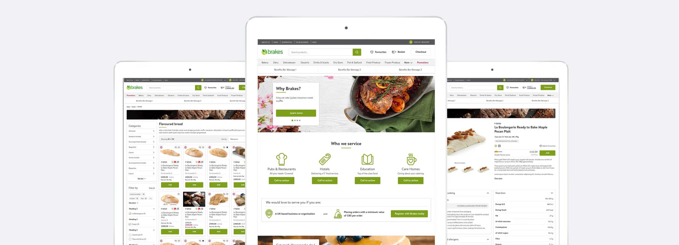
We designed the end-to-end customer experience for desktop and mobile, taking into account the opportunities and priorities the project had uncovered, creating a minimalistic interface that would allow customers to complete their tasks without distraction, whilst adhering to WCAG AA standards or above.
We then repurposed the new design system to create the design of a new website for Country Choice - leveraging all of the insight, innovation and design thinking from the Brakes design process to create a new digital presence for this secondary brand.

“The work you have done for us – in particular the mobile site – is outstanding, and what you bring to ecommerce was completely new to our business. Thanks to everyone in your team for the quality and integrity of the work you did – it is truly appreciated.”
Adam Collett - Group Marketing Director, Brakes

Our work resulted in
An open, cohesive digital presence for the Brakes brands based on a stripped back, highly usable design that allows customers to understand the benefits the business can offer, sign-up easily and find and purchase the items they need.
A visual language that delivers unparalleled levels of accessibility and inclusiveness to Brakes customers, allowing customers with permanent and situational impairment and customers with limited levels of literacy in English to participate in the new experience.
A range of personalised widgets and tools that allow customers to manage their accounts, favourites and orders, providing convenient service and support, whilst allowing the business to scale without increasing customer service costs.
Rich content that is integrated with the core purchase experience that inspires and supports, meeting both the practical and emotional needs of customers, but that also supports the acquisition of new prospects.
A platform for future growth for the business, with flexibility to adapt quickly to change, such as the continued development of the Brakes digital channels and the creation of a B2C proposition during the Covid pandemic.
Services we delivered
- Stakeholder interviews to ensure we were clear about the business priorities and our activities were aligned to delivering them.
- Deep-dive into existing data, results, research and other business documentation to create a solid foundation for the next steps of the project.
- Landscape review to identify best-of-breed examples of digital solutions that were relevant to the business objectives.
- Heuristic evaluation of the existing websites to identify opportunities for improvement, taking into account the latest approaches to presenting experiences on mobile devices and accessibility standards.
- Data analysis to clarify the user flows between the various digital domains and understand customer actions and outcomes.
- Created design concepts for the website look and feel, aligned to the brand guidelines - consistent with the accessibility requirements.
- Created a UI toolkit and an iconography library to maximise accessibility and inclusivity to form the foundation for the new site design.
- Drafted hundreds of wireframes to test our design hypothesis against the original design objectives for review and validation.
- Worked in close collaboration with engineering, data and content colleagues to ensure the functional requirements were feasible and could be delivered.
- Completed a full end-to-end design for the new site based on these foundational elements, in collaboration with the in-house development team.
- Collaborative design review meetings to review and iterate the design choices and align with the business objectives.
- Created a full design system to simplify future innovation and make it easy to create an identical experience for the Country Choice brand.


